Welcome to my blog!

The purpose of this blog is to explore my development of scrapbooking techniques. I will also provide reviews of products when I find something great or something terrible, and will show off all the work I enter in challenges and contests. Please check out my Welcome note if this is your first visit.

Feel free to ask questions about any of the materials or techniques shown here!

Please leave a comment and let me know what you think, or follow my blog so you can keep updated!

Happy Scrapping!


Showing posts with label color challenge. Show all posts

Monday, March 5, 2012

2SF Chase Away the Winter Blues Online Crop

Over the past week, Two Scrapbook Friends have had an online crop going on in their forums. The theme was "Chasing Away the Winter Blues" and each member of the design team presented a different, summer themed challenge for us to try out.

Joann's challenge: color inspiration based on this photo (and colors specifically orange and teal)

So anyone who regularly follows me knows this is an easy one - the wedding paper I use is orange and teal! But I forced myself not to use it and this is what I came up with:


The teal cardstock is Momenta from PA-1033, and the background paper, mice and journalling card are all from the Deja Views Cat's Life pad.


I did a ton of scrapbooking this weekend, plus we worked on the renos, so Precious didn't get much Mommy time. I actually had to pin her to keep her out of the photos taken of the above LO! Luckily she was sleeping when I took the rest below! 


Carolyn's challenge: Your favourite summer activity

I had a hard time with this one... what is my favourite summer activity??? Finally I settled on going to the beach, because I had these photos lying out on my work table because I wanted to scrap them soooo bad!!

The title was stamped using Martha Stewart stamps and Memento black ink. The "Discover" card is a transparency sticker from Making Memories.

I used Momenta for the background paper and mats, all from the Travel Pyramid Paper Pack (love these!) PK-2389. The flip flop stickers are from the Endless Summer collection ST-2116. I love using the Endless Summer and the new release Vacation set together, they coordinate so well!


Jayne's challenge: Use a postcard or postage stamp

Well this one was a first for me. I didn't know I had postage stamp or postcard embellies, and it turns out I have a bunch!


I used Momenta Travel Pyramid Paper Pack PK-2389 again, and actually made this layout on the reverse side of the one above for Carolyn's challenge. The stickers and journalling tag are also from the Vacation collection (ST-4952). I think the title vellum may be DCWV but I have had it for so long that I have no idea!!


Christa's challenge: Crash your summer stash

Here is my confession - I have nothing summer themed! I have vacation and holiday and party, and even BBQ, but nothing distinctly summer. I decided 4th of July themed papers were close enough...


This layout is some of the photos from visiting the USS Missouri while we were at Pearl Harbor. There is no journalling, because I want the plaque from the ship to speak for itself. The Japanese surrender was signed on the Mighty Mo and the original document was on board.

I used white Recollections cardstock, papers from an ancient Momenta holiday/season themed pack, and stickers from a 2009 Sticker a day calendar. The alphas are new, Colorbok peel and stick stacks, and I inked them with my DIs in Festive Berries and Weathered Wood.

The sketch is the Let's Scrap 2-29-12 sketch.


Sharlene's challenge: Scrap summer outdoor attire

So I went for a wayback playback here... this is lil ol' me in 1986 on a hot afternoon lounging in my too cute polka dot swimmer. Instead of going cutesy, I decided to go with a grungy 80s look.


The papers are both from DCWV Photo Stack 3, a brand new one I just picked up last month from Zeller's. I was sooo excited to see the third installment to this huge stack because I love my Stack 2, but it is getting a little thin :)

The alphas are  Momenta ST-4490, another new release. Its a multipack of black and white alphas in different sizes and styles. I love multipacks!

Finally, the buttons are stash from a 1 lb button bag from Michael's, and the phrase under the top baby photo is from Making Memories and is a transparent sticker.


Shelby's Challenge: Let the SUNSHINE in (use a sun)

I have to admit, this one was tough. I don't have any sun embellies, I don't have any paper with suns on it... I was stuck.

Then I remembered this paper I screwed up in January - I was trying to make a sunset like color blend on it and it ended up ugly. I used a bunch of distress inks on it and didn't like how it turned out. So I cut it up and made the beautiful sun you see below!


The papers are all Recollections in black and an orange-yellow base to the blending. I used Festive Berries, Spiced Marmalade and Wild Honey inks (and maybe a touch of Antique linen) and some Perfect Pearls mist in pearl to give it a shine.

Then I tried to hand-write the title and hated it. So I used Thickers in red foam and Fancy Pants Kraft alphas in Red & Gold to cover it up... how crafty lol!


Now... you should all head over to 2SF and check out the forum for the fun weekly challenges and other special events going on!


Thursday, December 8, 2011

CR84FN44 - Visiting Maman & Papa

So, the colors over at the CR84FN blog this week.... not so me.


So I flipped through my papers looking for inspiration, and found this gorgeous blue sky and cherry blossoms paper from DCWV. Decided I definitely wanted to use that paper (the point is to use up your stash), so then I went in search of photos to match.

What I found were these cute photos of me when I was little, posing for Mom with all the flowers at my grandparents home.

And so... a layout was born:


Now something weird happened when I took the photo - my coral (perfectly coral) paper magically turned more orange-y.... and I could not figure out how to fix it, although Picasa did a great job with their pure neutral match function. Could just be an issue with this monitor I use, who knows!

So I stitched on my cherry blossom paper using a tight zig zag on my machine, matted the photos in coral, and added some ancient Creative Memories light pink alphas. First time I used those alphas and I am addicted!! So cute and so easy to line up nicely with a ruler (too bad I didn't think of the ruler til half way through Visiting). I also added two glittered dots to the title. These are just glue dots dusted with Martha Stewart glitter. I am loving that idea, it is scraplifted off a Card/Stamp hop I did last week...

Other fun new product I tried on this was the Elmer's Adhesive Tape Runner. I really like it, better than the dot runner as it sticks even better.

Hope you enjoy!

The Color Room #87 - Untitled

I really love the fun palettes the Color Room provides, and I love that they add a sketch. I loved the sketch this week, but really didn't have the photos to make it happen... so that one is filed away for future use...

Anyways here is the fun palette:
 

The yellow and grey right away reminded me of some of my Cosmo Cricket EverAfter paper... but other than that, I was stuck. I picked out a blue paper and flipped through photos til I found the car my Best Man gave me for my wedding...


So I used the blue to mat the two photos of the model car, and then I inked the mats with some Wild Honey Distress Ink to bring in some more yellow. I also inked the edges of the yellow circle of CC with Wild Honey (opted not to use the yellow and grey side). For the large blue circle, its the same paper as the mats but uninked and I used Champagne Versamark to add the pattern to it. To add the "silver bells" I used these shiny silver accents all over and two little Jolee's silver flowers. Finally, the "linen white" is in the background paper, and the yellow strip across the middle.

As yet, this layout is going un-titled. I am really unsure what to call it and want to watch the wedding video and maybe add a quote from Alex's speech all about how he ordered me a new car. I was thinking about 1/24th of a car or something like that (its a 1/24th model) but I don't know yet :)  I also think I want to get some shiny silver alphas to title in... but again, not sure either lol.

Thanks for looking, and if you have a title idea, please help me out lol!

Wednesday, November 30, 2011

Scrap the Girls November - Classic Girly

Scrap the Girls is a fun, no-boys-allowed blog all about scrapping girls. I tried their November challenge this month.

The criteria were:
PINK AS THE DOMINANT COLOUR

MULTIPLE PICS

POLKA DOTS


and as always... NO BOYS!!

This is my take:

I used an ancient pink polkadot baby paper I had, a big fluffy flower, a Creative Memories journalling card, and two Deja Views photo mats from a wedding set. I also knotted the friendship bracelet mounted under the flower. Finally I added extra polka dots with some Jillibean Soup letters!

Photos are baby me at about 6 months of age. I asked my mom for a title and journalling on it - she said she was just playing with her camera photographing her favourite subject - MOI - le bebe aux yeux bleus :)  

Hope you enoy!!

Sunday, November 27, 2011

CR84FN3 and Paper Secrets Scraplift Challenge

Paper Secrets hosts a monthly scraplift challenge. Head on over to the forum to check it out as I don't have the permission to republish Steph's work!

What caught me was the clocks she used to make a strip on the page. I paired this challenge with the CR84FN3 as I envisioned the clocks on brown.

Here is the color image:


And here is my scraplift and color challenge:

I used Tim Holtz masks and Wild Honey Distress Ink to do the base coat. Then I added stamps of clocks in Walnut Stain and of suns in Versamark Champagne. I inked the edges of the paper in Walnut stain and a bit of white chalk. I cut out around the clock strip to insert the tan paper into the page. I tore one edge and used a bit more Wild Honey. Finally, to tone down the white mat under the photo, I used Peeled Paint Distress Ink. The scallop trim is Cosmo Cricket EverAfter.


Below are some detail photos of the masking and stamping: 


I hope you enjoy!

Monday, November 21, 2011

2SF Online Crop - Avril's Challenge

So the last post of a challenge I have from the Burst of Color Online Crop at Two Scrapbook Friends is from Avril.

Now this one stressed me out. We had to use ONE color photo and the rest in black & white. I don't have any black & white. I don't print in black and white. I don't really like it for scrapbooking because I love to pull colors out of the photos and splash them all over the page.

So I hummed and hawed... and thought and thought. I went through travel photos... but I just couldn't justify turning beautiful color photos to to black and white.

I gave up and flipped through the wedding photos with an idea to use 3-4 photos from one part of the shoot and do one in color. Well... that was a problem. I had only printed one from that shoot, and it was not the one I wanted in color, and I didn't want to waste it (I am sooo cheap!).

But then I found a sepia and two black and white photos (my photographer locked them in that coloring so I had no choice) that I had printed.... they were all of me at home getting ready and the shots before we left for the ceremony....


I thought it turned out stunning, and I had been waiting for a chance to use that paper with photos of me. The paper is My Mind's Eye Lost and Found 2 - LOVE IT! This is a great line, I am going back to 2SF to get some more papers from the collection as I only bought a few the first time.
Flower is Prima for the base two layers and unkown for the rest. Stickers of the flowers and doves are Jolee's and the phrase sticker is Cosmo Cricket Everafter.

Hope you enjoy this one!


2SF Online Crop - Carolyn's Challenge

Carolyn is the 2nd friend over at Two Scrapbook Friends.

She gave us an image for the online crop and the instructions that we had to use stitching as well.


I love that car paper in the background. I wanted some of it to make life easy. As I looked at the image hoping for inspiration, I thought of how those same bright colors said "Jimmy Buffett's Margaritaville" in Hawaii...

Now I am a huge Jimmy fan. Have been since I was little. My sister and I knew the words to "Why Don't We Get Drunk" when we didn't know what drunk was.... The rest of that line is "and Screw". LOL!!! Can you imagine some grade school and preschoolers singing that song? That's me and my sister... Thanks mom lol.

WAIT. Don't go calling Child Services or Children's Aid on us, first we're both now adults anyways, and I see no lasting damage (except that we know a lot of songs about alcohol)...

All over Waikiki there were ads and little tidbits for the Margaritaville Cafe. So I took photos of a few I loved - the front of the store, the painted Muskoka (or Adirondack) chairs, and this random canoe boat thing on the beach.... and those photos were selected based on the inspiration image.


Now you're thinking... where did that purple come from? I don't know. It was in my scrap box. It really wanted to be included on the page, and so it was :)

The stitching is done with my Kenmore (rebranded Singer) machine. Its the base model. It has 8 stitches, one of which happens to be this dashed zig zag. You can bet I'm gonna use that little baby again. (I used width 0.5 and length 5, or the other way around, if you want to know).

The alphas are Jillibean Soup (LOVE!) and the stickers of the guitar, flower and Hawaii are Jolee's. The two black neons are random stash finds :)

I am truly in love with this page. I feel Hawaii when I look at it - the sun, the sand, the never ending Jimmy Buffett music.... ahhhhhhhhhh.... 

2SF Online Crop - Christa's Challenge

I love the Burst of Color Online Crop over at Two Scrapbook Friends... color challenges are so fun, and the design team mixed it up a bit.

Christa didn't give us a specific color challenge - she instead required that we use a "rainbow" for on our layout - didn't have to be traditional but there had to be an array of colors. This was great as everyone did something different - some used non-traditional colored rainbows, some used stripes or swirls, others used dots. It was great overall.

I knew only one thing - I wanted to use embroidery floss as I had recently purchased a rainbow pack.

This is what I came up with:


For the circle embellie, I wrapped 9 different colors of floss around a black corrugated circle. I have had that corrugate forever - it is literally from the first scrapbooking pack I ever bought... and most of that pack is still untouched (clearly a bad choice!).

The rainbow paper is DCWV Photo Stack 2 (another ancient one). I really wanted this layout to feel rainbow-y to reflect all the colors of shave ice you get in Hawaii. We loved this stuff so much we had it probably 3 out of 7 days there.... and I would go back just for the Shave Ice.

I added a personal challenge to this challenge - use kraft. I have never used a whole piece of kraft. I have used kraft to mat a few photos once in my life and that is it. I hate it, I don't know what to do with it, and as my husband said "its just kinda boring, not like what you normally use".

But I like the contrast here - it helps ground all the crazy colors going on and add a bit of calm to the page (cuz it was crazy looking when I had it on the 12x12 of that rainbow paper).

I also think this will help it match the page next to it better... although I don't know what that page is yet lol!

Thanks for looking everyone!

2SF - Online Crop - Dee's Challenge

Two Scrapbook Friends hosted a Burst of Color online crop over at their forum this past week with challenges by the two friends and the design team.

Dee's challenge was a tough one - based on some fabric she has.


The "words" of the challenge were to use teal, cream and golden yellow.

For me - I don't really feel that a blue that light is teal (or my monitor is not very well calibrated and I am not seeing the right color, which is possible).

Either way, I decided to go with the descriptor "teal" rather than the fabric image itself, partly because the fabric image was added later.

This was a hard one for me. I couldn't find patterned paper with the three colors, I had almost no cardstock in the right colors, no scraps... bad news bears.

I ended up combining my version of teal blue cardstock, some golden yellow cardstock, and a textured cream cardstock from DCWV to make the layout.


I used foamie letters and a random golden tag I had as well, added a real toonie and a We R Memory Keepers gromlet from the stash which combined the fabric colors with a bit of green :)

Thanks for looking!

Thursday, November 17, 2011

2SF Online Crop - Shelby's Challenge - Green with Envy

Shelby provided the Green with Envy challenge for the 2SF Burst of Color online crop over at their forum.

Right away I groaned. Green is sooo not my color. I have some specific colors of green that I like, and I have 2 green sweaters, but thats about it for me and green.

So I whined.

Then I forced myself to just get it over with as then I could have fun doing the other colored challenges I liked so much better.


So there was no sun yesterday here, so the photo above is a little screwed up. The colors are actually what you see in the photo below - not sure why that one worked out so much better!

I picked the patterned paper because I wanted a pattern (Shelby used one in her preview) and it was the nicest green paper I had. Then I riffled through my photos looking for something that worked with the green - when I came upon Dylan in this orange shirt.

Add a Creative Memories journalling card, two CM photo mats and TA-DA the base layout was complete.

I was originally going to use my blue letters for the whole title, but I didn't have one of the letters for FACE and had already stuck them on. In retrospect, I love the two types of stickers much better anyways because it adds more emphasis to the key word in the title. The "Face" stickers are Rugged from CM.

The "True Story" sticker is also CM. This was really just a CM layout, other than a few letters and the base patterned paper and the Cricut flowers.


All in all a simple layout, but that is what I was going for with this one to emphasize the story.


Hope you enjoy, please comment, and follow!

Thanks

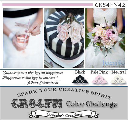
CR84FN2 - Nails

I am really loving doing color challenges. They make me think so hard about where it would work, and most of the time my original thought doesn't work out.

This week CR84FN brought us challenge 2 (actually the 3rd, it was numbered 0), which is shown below. You have to use the named colors as your main colors (aka you can add any other color in small amounts) and of course neutrals don't count (although for this one you have been given two neutrals).


This palette screams girly girl, babies, a trendy wedding scheme. Since my wedding was orange and green - there was no way pink was making it to another wedding page... at least not as the top color.

So I was thinking - why not our spa day? The actual photos from the day are terrible as they were taken on my old cell phone, but I wanted to document the day nonetheless.

Somehow there are no photos of my two bridesmaids? I wrote their names on the page to acknowledge they were there.

So here is my pale pink, neutral (cream) and black layout:


Under the title I added a tiny bit of journalling. I also made this cute stacked flower using two Cricut cut flowers, a Recollections punched flower, and a clear bling to draw in the clear bling on the black flowers (Jolee's). The border around the striped circle is also from my Recollections punch - I went a bit punch crazy for another LO and used all those and still have a stack of them on my desk!

Thanks for looking and please comment and follow my blog! Hope to see you back here soon!

Monday, November 14, 2011

2SF Online Crop - Sharon's Challenge

Sharon's challenge over at the 2SF forum was to use blue. Not just blue... specific requirements:

at least 2 different shades of blue cardstock
at least 2 different blue patterned papers
and at least 2 different blue embellishments!

I knew this one would be fairly easy as I have tons of blue everything (although not a lot of blue embellies) and I love blue... To challenge myself I decided I wanted to make it somewhat of a monochromatic page as well...

I went immediately to the Hawaii album and selected a few topics. In the end, the blue Jolee's helicopter embellie sealed the deal.

I've really decided "recipe" challenges like this one and those over at HMITM are my favs :)

So this is what I came up with:


So for two patterened papers I used a "stripe" and a "spot". The spot is DCWV The Glitter Stack. The stripe is out of a holiday stack I have.

For two cardstocks - I used 6. 3 for the large circles, 2 for the flowers to accentuate the title letters on the title, and one for the background (although its debatable if that is a solid or a pattern?)

Finally, my two blue embellies are the helicopter and this glittery button like thing with a map of Hawaii on it.... I might see if I can cut a mini volcano and glue it on the map where the volcano is...

All the embellies are Jolee's and I'm not sure about the sticker letters.


Also - fun fact - this is my first circle based layout I've done without using a sketch. Yay me!


Thanks for looking and please comment and follow!


2SF Online Crop - Joanne's Color Challenge

Ladies... head on over to the Two Scrapbook Friends forum and join in on this fun online crop. The DT and the 2SF themselves each put up a color-based challenge, and all layouts are due Sunday.

Joanne (one of the 2SF) gave us this image:

And instructions to use pink and lime green.

This screamed baby to me... but I couldn't find any suitable baby photos (pink does not go with the orange furniture my mom had lol)... then I decided Hawaii! It feels very Hawaii!

Then I bent over to find my cutter (or maybe to pet Casper) and saw this $4 pack of paper I got on clearance at Michaels... and the whole plan changed!


Then I had to scramble through my stash for lime green and pink papers to match. The pink was easy... but I really didn't think I had lime green. Turns out there was one 12x12 hiding in my pack of 250 colored cardstocks. *phew*

Somehow I'm going to have to find more lime green paper as I have a few more sheets of this chandelier paper to use up..


Then I started stressing about embellies. I was convinced I had nothing in lime green.... so I pulled out my bin of random mini embellies and found the foam flowers and the swirly things. I got discouraged, walked away, and then came back. Went over to the bed to pet Casper (I scrap so much better now that I have him lol) and looked down into the open drawer under the bed and simultaneously saw the container of flowers and the ribbon. Its hard to tell, but the centres on the flowers on the ribbon are lime green.

By then end of my rooting around, I had a large pile (think 2 cups worth) of lime and pink embellies to add to my page!

Clearly this one was meant to be, and now I know I have lots of lime (except paper).

Thanks for looking, and please comment and follow!

Friday, November 4, 2011

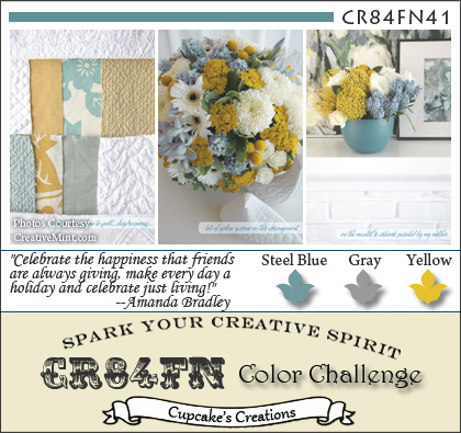
CR84FN Color Challenge #1

This week, I found this fab blog, CR84FN, who hosts color challenges. I love color challenges because they are a great way to expand your horizons. Most of the time, the colors are not ones you would select on your own, so its a great way to get out of the box and get those creative juices flowing.

This is the inspiration image:

I really love how they give you multiple images plus the color swatches of the colors they are into.

When I saw steel blue, I thought immediately of my DCWV "Neutrals" textured cardstock pad - it has a fabulous steel or icy blue, more like the flowers than the swatch. The yellow and gray combo brought me right back to my wedding theme papers - Cosmo Cricket's EverAfter (2009 release), as there are some beautiful yellow and gray patterns included in the package

I also thought "boys" - how stereotypical... but in flipping through the wedding photos I really liked how the colors set off the limo.. and so this page was born:


The limo embellie is Jolee's, blue flowers are Creative Memories, and large flowers are Recollections, chipboard is Momenta (I think).

Enjoy!

Tuesday, November 1, 2011

Moxie Fab World Tuesday Trigger "Autumn Woods"

When I saw this Trigger inspiration photo over at Moxie Fab World, I was immediately inspired.

First, the colors took me back to my beautiful wedding bouquet with its variations on oranges and greens, with a touch of yellow, red and brown. I also loved the squares and the dimensional aspect of it all, and was determined to combine this into a fantastic layout... and here it is!


This was a great challenge because all the paper I used came out of my scrap bin! I am a hoarder when it comes to scraps, I know there are some pieces I will never be able to use but I can't throw them away, so into a big basket they go! Luckily I had lots of coordinating reds, oranges, yellows and a bit of green and brown left over from other projects.

I used my Creative Memories square punch to punch all the squares. I then inked the edges with Distress Ink - Walnut stain. I used 1/8" adhesive foam squares to "pop" out some of the squares, adding to the dimensional feel of the layout.

I finished off with a few photos, including one I fussy-cut.


I had a lot of fun with this one, and still have to add the title. It will be made of letter charms strung on a piece of twine (somewhere in the mail on the way to my house right now) and wrapped around the photo of me with the flowers. 

Wednesday, October 26, 2011

Frosted Designs Fabulous Friday Challenge - Colors - October 21st

The Fabulous Friday over at Frosted Designs this week was to use the colors from the inspiration photo, and only those colors - but you didn't have to use all 4.

Here is the photo:


And here is my take on it


The purple color really didn't work for me, although I did pull out some purple cardstock entirely intending to use all 4. However, purple is really not a color I like or even use, and with the green, orange and red, I thought it was great as it was and decided against adding any purple.

The journal card and photo mats are from the Creative Memories Reminisce collection. This is really a great pack because you get full size (4x6) journal cards and half size (2x3) cards as well, oriented both vertically and horizontally.

I'm looking forward to the next Fabulous Friday challenge to see what they have me doing next...